AI Health-Mate
AI Health-Mate
I integrated popular health-tracking app features into a more
Useful and In-Demand Product.
I integrated popular
health-tracking app features into a more
Useful and In-Demand Product.
I integrated popular health-tracking app features into a more
Useful and
In-Demand Product.


Design directions and iterations were based on user tests, heuristic evaluation, and a substantial amount of time for observation and self-reflection.
Product Highlights
Monetize way
Increase retention rate
Power of our AI doctor
Utility and personalize experience
Keep User Engage
Anxiety Level Evaluate
Get Motivated With Our Warm Community
Heuristic guide user and business success
Easy connection to your data
Accessibility
Design directions and iterations were based on user tests, heuristic evaluation, and a substantial amount of time for observation and self-reflection.
Monetize way
Product Highlights
Increase retention rate
Power of our AI doctor
Utility and personalize experience
Keep User Engage
Anxiety Level Evaluate
Get Motivated With Our Warm Community
Heuristic guide user and business success
Easy connection to your data
Accessibility
Time: Feb-July 2024
My Role: Product Designer
An AI doctor trained by authoritative medical data,
By providing personalized health feedback through an engaging user Interface and storytelling to help users achieve their health goals.
An AI doctor trained by authoritative medical data,
By providing personalized health feedback through an engaging user Interface and storytelling to help users achieve their health goals.
Feb-July 2024
My Role: Product Designer
Having a healthy body and mind is an essential demand.
However countless health apps in the market are designed for various tracking purposes.
Having a healthy body and mind is an essential demand.
However countless health apps in the market are designed for various tracking purposes.
I used Kraftful (AI-based research tool) to understand
the landscape within the Health-Tracking App Industry.
I used Kraftful
(AI-based research tool)
to understand the landscape within the Health-Tracking App Industry.
I used Kraftful (AI-based research tool) to understand the landscape within the Health-Tracking App Industry.

What I Have Discover
What I Have Discover
The users get tired of running multiple health apps to satisfy their healthcare needs from different perspectives.
The existing integrated health tracker app has many challenges that typically result from overloaded features.
Lack of organization users feel intricate in navigating them.
The users get tired of running multiple health apps to satisfy their healthcare needs from different perspectives.
The existing integrated health tracker app has many challenges that typically result from overloaded features.
Lack of organization users feel intricate in navigating them.
both were High-rated
health-tracking Apps in the market.
Bearable
offers a broader range of tracking options, Symptoms, Mood, Sleep, Diet, Activity, Energy Levels, Medication, and Weather. Suitable for managing overall well-being.
Bearable
offers a broader range of tracking options, Symptoms, Mood, Sleep, Diet, Activity, Energy Levels, Medication, and Weather. Suitable for managing overall well-being.
ADA
Health primarily focuses on symptom assessment and provides personalized recommendations.
ADA
Health primarily focuses on symptom assessment and provides personalized recommendations.

Market Advantage
Ada
demonstrating impressive accuracy for an AI-based tool.
provides trusted medical advice up to 3x more accurate than other symptom trackers.
In a study published in BMJ Open, doctors accurately diagnosed patients in 82% of cases.
Ada tracker scored 71% comes remarkably close.
Ada
demonstrating impressive accuracy
for an AI-based tool.
provides trusted medical advice up to 3x more accurate than other symptom trackers.
In a study published in BMJ Open, doctors accurately diagnosed patients in 82% of cases. Ada tracker scored 71% comes remarkably close.
Market Advantage
Bearable
is backed by scientific review as one of the best mobile health applications for tracking patient-reported outcomes.
Clinicians recognize its utility, especially for oncology patients. Sets them apart from competitors.
Bearable
backed by scientific review as one of the best mobile health applications for tracking patient-reported outcomes.
Clinicians recognize its utility, especially for oncology patients. Sets them apart from competitors.
Market Weakness
Ada
Not Perfect: Real doctors still outperform online diagnosis. Users usually feel less secure than getting advice from a real doctor.
Its feature is pretty straightforward with a Q&A approach. Lacks other tracking options and features.
Ada
Not Perfect: Real doctors still outperform online diagnosis. Users usually feel less secure than getting advice from a real doctor.
Its feature is pretty straightforward with a Q&A approach. Lacks other tracking options and features.
Bearable’s
Lack in formalize UI Language: Holistic health tracking is a dual blade when its lack of organizing on uI. too many features and contents makes users get frustrated or lost.
Misleading-Advertise as a free app: Users report after they fill out a vast amount of their data they don't get the insight they expect, at that point the app asks for a subscription.
Bearable
Lack of formalized UI Language: Holistic health tracking is a dual blade when its lack of organizing on uI. too many features and contents make users get frustrated or lost.
Misleading-Advertise as a free app: Users report after they fill out a vast amount of their data they don't get the insight they expect, at that point the app asks for a subscription.

Lin

Jiahn

Jakub
To further understand the user's perspective
I interviewed 3 participants, ages 29, 34, and 40
who actively engage with Health-tracking apps.
Their occupation are doctors and designers.
With 3 interview questions in mind.
I want to know their attitudes
of the health-tracking app they are currently actively engaged.
Motivation And Goals
for using the health-tracking app, gain insight from their story.
Expectations
on the feature of the health-tracking app.
Interview notes that reveal the user's needs, goals, and motivation were categorized into 6 clusters in an affinity map,
An effective tool to help me synthesizing findings.


Jiahn
The accuracy is what I worry about for a online diagnosis.
I want be more proactive with daily exercise.
Lin
A good health app should be cost-effective and easy to use.
I feel lack motivation to get a better physic due to long day of work.

Jakub
I want a quick diagnosis from a trustworthy resource. Clinic and online doctors usually took a while to get my answer.
paint points
What are we going
to deliver
A safe community for users to share stories and make connections.
A news panel to post Motivational content and health-related news to inform users.
Monitor overall health by inputting various factors and able to generate live feedback.
Set up a plan and goal. Ongoing tracking processes provide flexibility which secures healthy longevity.
Health specialist (AI) who can answer most general health-related topics.
Warm notifications with motivated content to keep them engaged.
Facilitate users by pointing out the facts.
Accessibility:
Easy to use for different age groups Followed by wCAG Guideline.
Additional resource
-Recipes
-White noise.
-input factors while off-line.
-Offer a wide range of tracking options.
-Streamline medical record logging.
-Tailored Q & A diagnosis approach.
-AI doctor trained with prestigious medical data.
-Offer High flexibility for goal and plan tracking.
-Building a positive community to facilitate users.
-Adapt and develop unique monetizing methods.
Product Goals:
Incorporate competitors' strengths
while maintaining our uniqueness.
Aim for an intuitive and accessible user experience through the formalized UI design language.
Unique by it's branding using cutting-edge visuals & interaction design workflow.
Using synthesize data and initial plan, I created our two major personas, their diverse backgrounds will offer more insights into understanding the customer’s journey.


Lin
Jiahn
Jakub
To further understand the user's perspective
I interviewed 3 participants, ages 29, 34, and 40
who actively engage with Health-tracking apps.
Their occupation are doctors and designers.
With 3 interview questions in mind.
I want to know their attitudes
of the health-tracking app they are currently actively engaged.
Motivation And Goals
for using the health-tracking app, gain insight from their story.
Expectations
on the feature of the health-tracking app.
Interview notes that reveal the user's needs, goals, and motivation were categorized into 6 clusters in an affinity map,
An effective tool to help me synthesize findings.
Jiahn
The accuracy is what I worry about for a online diagnosis.
I want be more proactive with daily exercise.
Lin
A good health app should be cost-effective and easy to use.
I feel lack motivation to get a better physic due to long day of work.
Jakub
I want quick diagnosis from a trustworthy resource. Clinic and online doctor usually took a while to get my answer.
insights and paint points
To further understand the user's perspective
I interviewed 3 participants, ages 29, 34, and 40
who actively engage with Health-tracking apps.
Their occupation are doctors and designers.
Lin
Jiahn
Jakub
With 3 interview questions in mind.
I want to know their attitudes
of the health-tracking app they are currently actively engaged.
Motivation And Goals
for using the health-tracking app, gain insight from their story.
Expectations
on the feature of the health-tracking app.
Interview notes that reveal the user's needs, goals, and motivation were categorized into
6 clusters in an affinity map,
An effective tool to help me synthesize findings.
paint points
Jiahn
The accuracy is what I worry about for a online diagnosis.
I want be more proactive with daily exercise.
Lin
A good health app should be cost-effective and easy to use.
I feel lack motivation to get a better physic due to long day of work.
Jakub
I want quick diagnosis from a trustworthy resource. Clinic and online doctor usually took a while to get my answer.
What our user care
Credibility & Accuracy
positive Community
Quick Access to the product
Motivation & facilitating
Rich Resource & Efficient Inquiry
free version consist of basic needs
What are we going to deliver
A safe community for users to Share story to motivate each other and chat.
A news panel to post Motivation content and health-related news to inform users.
Monitor overall health by inputting various factors and able to generate live feedback.
Set up a plan and goal. Ongoing tracking processes provide flexibility which secures healthy longevity.
Health specialist (AI) who can answer most general health-related topics.
Warm notifications with motivated content to keep them engaged.
Facilitate users by pointing out the facts.
Health specialist (AI) who can answer most general health-related topics.
Warm notifications with motivated content to keep them engaged.
Facilitate users by pointing out the facts.
Accessibility: Easy to use for different age groups Follow by wCAG Guideline.
Additional resource
-Recipes
-White noise.
-input factors while off-line.
Accessibility: Easy to use for different age groups Followed by wCAG Guideline.
Additional resource
-Recipes
-White noise.
-input factors while off-line.
Product Goals:
Incorporate competitors' strengths
while maintaining our uniqueness.
-Offer a wide range of tracking options.
-Streamline medical record logging.
-Tailored Q & A diagnosis approach.
-AI doctor trained with prestigious medical data.
-Offer High flexibility for goal and plan tracking.
-Building a positive community to facilitate users.
-Adapt and develop unique monetizing methods.
Aim for an intuitive and accessible user experience through the formalized UI design language.
Unique by it's branding using cutting-edge visuals & interaction design workflow.
Our two major personas and their diverse background offered fantastic insights into understanding the customer’s journey.
Creating user journeys allows me to understand the user's perspective,
helping me discover additional opportunities to build the user's desired features.
-VoiceOver for health instruction and articles.
-Work out music library.
-Provide a linear graph for tracking progress.
-Gamification content to reward and facilitate users.
-Use visual elements to indicate the body's needs, such as food, sleep, medication, and exercise.
-Encourage users to share their health stories to help shape a warm and supportive community.
Creating user journeys allows me to understand the user's perspective,
helping me discover the opportunities to build the user's desired features.
-Voiceover for health instruction and articles.
-Work out music selection.
-Provide a linear graph for tracking progress.
-Gamification content to reward and facilitate users.
-Use visual elements to indicate the needs of the body. Such as food, sleep, medication, and exercise.
-Encourage users to share their health stories to help shape a warm and supportive community.


site map has been refined after gaining additional insight from the card sorting test.


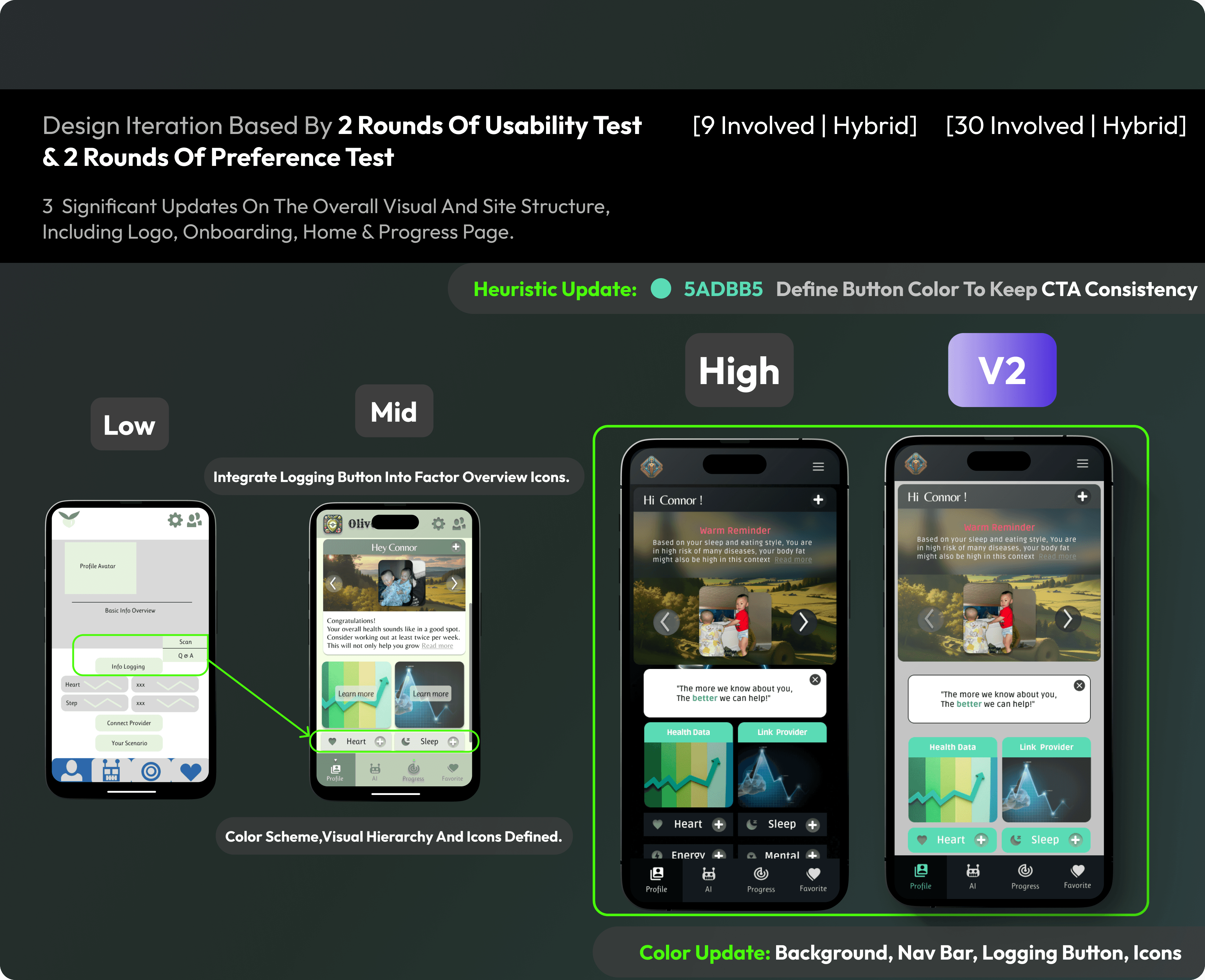
Design iteration based by
2 rounds of usability test
[9 involved | Hybrid]
& 2 rounds of preference test
[30 involved | Hybrid]
significant updates
-overall visual and site structure
-logo
-onboarding
-home
-progress page
Low
integrate logging button
into factor Overview icons.
Mid

Color schemes,
Visual Hierarchy and icons defined.
Heuristic update:
5ADBB5
Define Button color to keep
CTA consistency
high
v2


color Update:
background, nav bar,
logging button, Icons
main User Flow for our product.
Our site map has been refined after gaining additional insight from the card sorting test.
The site map was refined after gaining additional insight from the card sorting test.

Design iteration based by 2 rounds of usability test
& 2 rounds of preference test
[9 involved | Hybrid]
[30 involved | Hybrid]
3 significant updates on the overall visual and site structure,
including logo, onboarding, home & progress page.
Low
integrate logging button into factor Overview icons.
Mid
Color scheme,Visual Hierarchy and icons defined.
Heuristic update:
5ADBB5
Define Button color to keep CTA consistency
high
v2
color Update:
background, nav bar, logging button, Icons
Mid to High Process
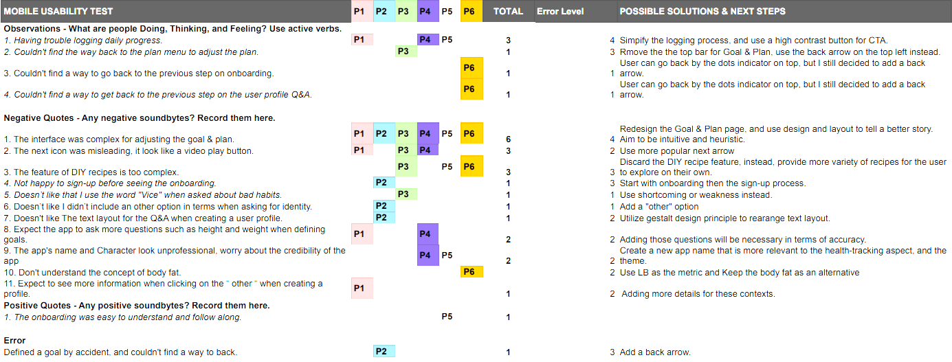
By conducting a usability test with 6 participants I discover:
3 out of 6 testers are Having trouble logging daily progress.
Solution: Simplify the logging process and use a high contrast button for CTA.
6 out of 6 testers think the interface was complex for adjusting the goal & plan.
Solution: Redesign the Goal & Plan page, and use design and layout to tell a better story. Aim to be intuitive and heuristic.
3 out of 6 testers think the feature of DIY recipes is difficult; they would rather have more variety of options.
Solution: Discard the DIY recipe feature and instead provide more variety of recipes for the user to explore on their own.

Updates Mid to High
Overall color scheme,
visual components, and spacing.
Site structure:
-New Design language system.
-New Onboarding screens with updated visuals and copywriting.
-Logging process.
-Recipe strategies.
-Remove the tab bar on the progress page, instead add a new entry point to connect to the goal & plan page.

The major profile structure are defined, user can log their medical condition by Q & A with topic or scan documents.
Offer full range of flexibility to Adjust Health Goal & Plan, metric change accordingly.
The conversations are stored on the AI domain page for easy access and make further conversation.
Low
On Board &
Sign Up
Create Profile
Define
Goal
Change
Goal
Logging Progress
mid
The new design receive high values of positive feedback,
100% of previous testers have completed the tasks and 90% of testers think the new user interface is intuitive and easy to use.
Monetize way
-Unlimited health goals & plans, and the user profiles.
-Instant saving Offer Medical product coupon.
Increase retention rate
-Focus on building a happy path for new users to let them get to their
'Woo Hoo' moment faster.
This will allow new users to skip the initial setup and prioritize testing our AI chatbot.
Power of our AI doctor
-Trained by authoritative medical data,
This will reflect our business credibility.
Utility and personalize experience
-Identify users' ability first then craft a suitable healthcare experience.
-Clean and intuitive User Interface.
-Different Themes.
Keep User Engage
-Explore thousands of recipes and workout videos tailored to your needs.
Anxiety Level Evaluate
-Provide insight and solutions based on anxiety Level assessment results.
Get Motivated With Our Warm Community
-Share stories and make connection.
Heuristic Design
Guide User Success.
-Design System Highlights.
Easy connect to your data
-Effortlessly synchronize data from your healthcare providers or by scanning documents.
Accessibility
-Our design strictly adheres to WCAG guidelines.
Logging Progress
Update
-Visual
-Copy writing
Define
Goal
Update
-Visual
-Copy writing
Change
Goal
Update
-Page Structure
-Components
-Interactions
Progress
Page
Update
-Page Structure
New Features
-Calorie Calculator
-Filter & Search
-Progress Tracker
-Manage Plans
Goal-Page
Logging
Update
-New Logging Entry Point.
-Interaction
Progress-Page
Logging
Update
-Interaction
High
Create Profile
Update
-Copy Writing
Define
Goal
Update
-New Metric added for Weight loss.
Change
Goal
Update
-Title Color
-Interactions
Progress
Page
Update
-Video Description are now toggle on by default.
Goal-Page
Logging
Update
-Pie Chart visual interaction.
Progress-Page
Logging
Update
-Pie Chart visual interaction.
V2
Process
By conducting a usability test with 3 participants I discover:
2 out of 3 think the overall visual in progression page are too intense.
1 tester were offended by the title “Vice” , one of the profile Q & A question.
Additionally By conducting 2 round of hybrid preference tests with 20 participants I discover:
15 out of 20 participants would like to see the interface to have fewer focal points.
Insight: Visual expression still have some room to improve.
Solution: Delete the background image, spacing out the contents to provide more white space to breathe, and change the title “vice” to habit instead.

Updates High to V2
Button Color
-Profile Logging Buttons
-Secondary Button.
-Background Choice and Spacing.
-Pie Chart visual interaction, inform the user with heuristic Design.
-Color for Nav Bar Current state.
-Color for Unclickable Icon (Page Current State)
An integrated teammate.
A Product Designer
with strong UI skills and
solid UX thinking.
Feel Free to Collaborate !
Passion for innovate new functionality and mechanic
For in-demand product ideas relevant to our current market.

Passion for Building Remarkable Sensation.
Mid to High Process
By conducting a usability test with 6 participants I discover:
3 out of 6 testers Having trouble logging daily progress.
Solution: Simpify the logging process and use a high contrast button for CTA.
6 out of 6 testers think the interface was complex for adjusting the goal & plan.
Solution: Redesign the Goal & Plan page, and use design and layout to tell a better story. Aim to be intuitive and heuristic.
3 out of 6 testers think the feature of DIY recipes is difficult, they will rather have more variety of options instead.
Solution: Discard the DIY recipe feature, instead, provide more variety of recipes for the user to explore on their own.
Updates Mid to High
Over-all color scheme, visual components and spacing.
Site structure:
-New Design language system.
-New Onboarding screens with updated visual and copywriting.
-Logging process.
-Recipe strategies.
-Remove tab bar on progress page, instead add a new entry point to connect between goal & plan page.
The major profile structure are defined, user can log their medical condition by Q & A with topic or scan documents.
Offer full range of flexibility to Adjust Health Goal & Plan, metric change accordingly.
The conversations are stored on the AI domain page for easy access and make further conversation.
Low
On Board &
Sign Up
Create Profile
Define
Goal
Change
Goal
Logging Progress
mid
Logging Progress
Update
-Visual
-Copy writing
Define
Goal
Update
-Visual
-Copy writing
Change
Goal
Update
-Page Structure
-Components
-Interactions
Progress
Page
Update
-Page Structure
New Features
-Calorie Calculator
-Filter & Search
-Progress Tracker
-Manage Plans
Goal-Page
Logging
Update
-New Logging Entry Point.
-Interaction
Progress-Page
Logging
Update
-Interaction
High
Create Profile
Update
-Copy Writing
Define
Goal
Update
-New Metric added for Weight loss.
Change
Goal
Update
-Title Color
-Interactions
Progress
Page
Update
-Video Description are now toggle on by default.
Goal-Page
Logging
Update
-Pie Chart visual interaction.
Progress-Page
Logging
Update
-Pie Chart visual interaction.
V2
Process
By conducting a usability test with 3 participants I discover:
2 out of 3 think the overall visual in progression page are too intense.
1 tester were offended by the title “Vice” , one of the profile Q & A question.
Additionally By conducting 2 round of hybrid preference tests with 20 participants I discover:
15 out of 20 participants would like to see the interface to have fewer focal points.
Insight: Visual expression still have some room to improve.
Solution: Delete the background image, spacing out the contents to provide more white space to breathe, and change the title “vice” to habit instead.
Updates High to V2
-Button Color
Profile Logging Buttons
Secondary Button.
-Background Choice and Spacing.
-Pie Chart visual interaction, inform user with heuristic Design.
-Color for Nav Bar Current state.
-Color for Unclickable Icon (Page Current State)
The major profile structure are defined, user can log their medical condition by Q & A with topic or scan documents.
Offer full range of flexibility to Adjust Health Goal & Plan, metric change accordingly.
The conversations are stored on the AI domain page for easy access and make further conversation.
Low
On Board &
Sign Up
Create Profile
Define
Goal
Change
Goal
Logging Progress
mid
Updates Mid to High
Over-all color scheme, visual components and spacing.
Site structure:
-New Design language system.
-New Onboarding screens with updated visual and copywriting.
-Logging process.
-Recipe strategies.
-Remove tab bar on progress page, instead add a new entry point to connect between goal & plan page.
Mid to High Process
By conducting a usability test with 6 participants I discover:
3 out of 6 testers Having trouble logging daily progress.
Solution: Simpify the logging process and use a high contrast button for CTA.
6 out of 6 testers think the interface was complex for adjusting the goal & plan.
Solution: Redesign the Goal & Plan page, and use design and layout to tell a better story. Aim to be intuitive and heuristic.
3 out of 6 testers think the feature of DIY recipes is difficult, they will rather have more variety of options instead.
Solution: Discard the DIY recipe feature, instead, provide more variety of recipes for the user to explore on their own.
Logging Progress
Update
-Visual
-Copy writing
Define
Goal
Update
-Visual
-Copy writing
Change
Goal
Update
-Page Structure
-Components
-Interactions
Progress
Page
Update
-Page Structure
New Features
-Calorie Calculator
-Filter & Search
-Progress Tracker
-Manage Plans
Goal-Page
Logging
Update
-New Logging Entry Point.
-Interaction
Progress-Page
Logging
Update
-Interaction
High
Create Profile
Update
-Copy Writing
Define
Goal
Update
-New Metric added for Weight loss.
Change
Goal
Update
-Title Color
-Interactions
Progress
Page
Update
-Video Description are now toggle on by default.
Goal-Page
Logging
Update
-Pie Chart visual interaction.
Progress-Page
Logging
Update
-Pie Chart visual interaction.
V2
Updates High to V2
-Button Color
Profile Logging Buttons
Secondary Button.
-Background Choice and Spacing.
-Pie Chart visual interaction, inform user with heuristic Design.
-Color for Nav Bar Current state.
-Color for Unclickable Icon (Page Current State)
Process
By conducting a usability test with 3 participants I discover:
2 out of 3 think the overall visuals on the progression page are too intense.
1 tester was offended by the title “Vice”, one of the profile Q & A questions.
Additionally, By conducting 2 rounds of hybrid preference tests with 20 participants, I discover:
15 out of 20 participants would like to see the interface to have fewer focal points.
Insight: Visual expression still has some room to improve.
Solution: Delete the background image, spacing out the contents to provide more white space to breathe, and change the title “vice” to habit instead.
The new design receive high values of positive feedback,
100% of previous testers have completed the tasks and 90% of testers think the new user interface is intuitive and easy to use.
Monetize way
-Unlimited health goals & plans, and the user profiles.
-Instant saving Offer Medical product coupon.
Increase retention rate
-Focus on building a happy path for new users to let them get to their
'Woo Hoo' moment faster.
This will allow new users to skip the initial setup and prioritize testing our AI chatbot.
Power of our AI doctor
-Trained by authoritative medical data,
This will reflect our business credibility.
Utility and personalize experience
-Identify users' ability first then craft a suitable healthcare experience.
-Clean and intuitive User Interface.
-Different Themes.
Keep User Engage
-Explore thousands of recipes and workout videos tailored to your needs.
Anxiety Level Evaluate
-Provide insight and solutions based on anxiety Level assessment results.
Get Motivated With Our Warm Community
-Share stories and make connection.
Heuristic Design
Guide User Success.
-Design System Highlights.
Easy connect to your data
-Effortlessly synchronize data from your healthcare providers or by scanning documents.
Accessibility
-Our design strictly adheres to WCAG guidelines.
Monetize way
-Unlimited health goals & plans, and the user profiles.
-Instant saving Offer Medical product coupon.
Increase retention rate
-Focus on building a happy path for new users to let them get to their
'Woo Hoo' moment faster.
This will allow new users to skip the initial setup and prioritize testing our AI chatbot.
Power of our AI doctor
-Trained by authoritative medical data,
This will reflect our business credibility.
Utility and personalize experience
-Identify users' ability first then craft a suitable healthcare experience.
-Clean and intuitive User Interface.
-Different Themes.
Keep User Engage
-Explore thousands of recipes and workout videos tailored to your needs.
Anxiety Level Evaluate
-Provide insight and solutions based on anxiety Level assessment results.
Get Motivated With Our Warm Community
-Share stories and make connection.
Heuristic Design
Guide User Success.
-Design System Highlights.
Easy connect to your data
-Effortlessly synchronize data from your healthcare providers or by scanning documents.
Accessibility
-Our design strictly adheres to WCAG guidelines.
Monetize way
-Unlimited health goals & plans, and the user profiles.
-Instant saving Offer Medical product coupon.
Increase retention rate
-Focus on building a happy path for new users to let them get to their
'Woo Hoo' moment faster.
This will allow new users to skip the initial setup and prioritize testing our AI chatbot.
Power of our AI doctor
-Trained by authoritative medical data,
This will reflect our business credibility.
Utility and personalize experience
-Identify users' ability first then craft a suitable healthcare experience.
-Clean and intuitive User Interface.
-Different Themes.
Keep User Engage
-Explore thousands of recipes and workout videos tailored to your needs.
Anxiety Level Evaluate
-Provide insight and solutions based on anxiety Level assessment results.
Get Motivated With Our Warm Community
-Share stories and make connection.
Heuristic Design
Guide User Success.
-Design System Highlights.
Easy connect to your data
-Effortlessly synchronize data from your healthcare providers or by scanning documents.
Accessibility
-Our design strictly adheres to WCAG guidelines.
Monetize way
-Unlimited health goals & plans, and the user profiles.
-Instant saving Offer Medical product coupon.
Increase retention rate
-Focus on building a happy path for new users to let them get to their
'Woo Hoo' moment faster.
This will allow new users to skip the initial setup and prioritize testing our AI chatbot.
Power of our AI doctor
-Trained by authoritative medical data,
This will reflect our business credibility.
Utility and personalize experience
-Identify users' ability first then craft a suitable healthcare experience.
-Clean and intuitive User Interface.
-Different Themes.
Keep User Engage
-Explore thousands of recipes and workout videos tailored to your needs.
Anxiety Level Evaluate
-Provide insight and solutions based on anxiety Level assessment results.
Get Motivated With Our Warm Community
-Share stories and make connection.
Heuristic Design
Guide User Success.
-Design System Highlights.
Easy connect to your data
-Effortlessly synchronize data from your healthcare providers or by scanning documents.
Accessibility
-Our design strictly adheres to WCAG guidelines.
An integrated teammate.
A Product Designer
with strong UI skills and
solid UX thinking.
Feel Free to Collaborate !
Passion for innovate new functionality and mechanic
For in-demand product ideas relevant to our current market.

Passion for Building Remarkable Sensation.

Passion for Building Remarkable Sensation.
An integrated teammate.
A Product Designer
with strong UI skills and
solid UX thinking.
Feel Free to Collaborate !
Passion for innovate new functionality and mechanic
For in-demand product ideas relevant to our current market.
